UX Design: the craft of supporting user behaviour by designing interaction to make it easier for them.
For the main project in my CF course on UX design I had chosen a so-called »expert app«, the framework of which was to provide a means of interaction between a body of »users« and a range of »experts«.
Students were challenged to come up with ideas and answers for the following:
- A suitable „theme“ for the app narrowing down the areas of expertise needed and a name to go with it
- Research on probable users and conceptualizing incentives to get them interested
- Identifying and designing flows significant enough to introduce future users and developers to viability of the concept
Now this resembles a real-life situation for UX designers in some regards — you may have ideas, but unless they are weighted against market realities and potential audiences, what is their worth?
Many market ideas have been explored already, and the market shares are bitterly fought over. Some seem intriguing, but there is no market big enough for them.My initial ideas quickly coalesced around having the unifying theme be
DO IT YOURSELF WORK AROUND THE HOUSE
as competitive analysis suggested that this particular wheel had not been invented to satisfaction. And while expert apps exist on broad and limited subjects, DIY so far lacks a killer app.
My research narrowed the reasons for this down to the following:
Hypotheses
UX for the app needs to address unique requirements of DIY users.
Compensation for experts needs to account for the expectation and experience that „DIY advice should be free between comrades in need“ (original quote).
Expert pages should feature user-based feedback and ratings systems to build confidence and word of mouth.
HAMMERHEAD may be a good name for the project (once I had reluctantly said goodbye to „deus ex machina“).
Research process and survey results
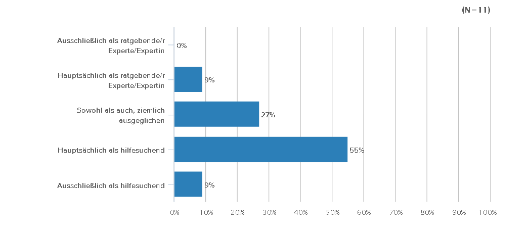
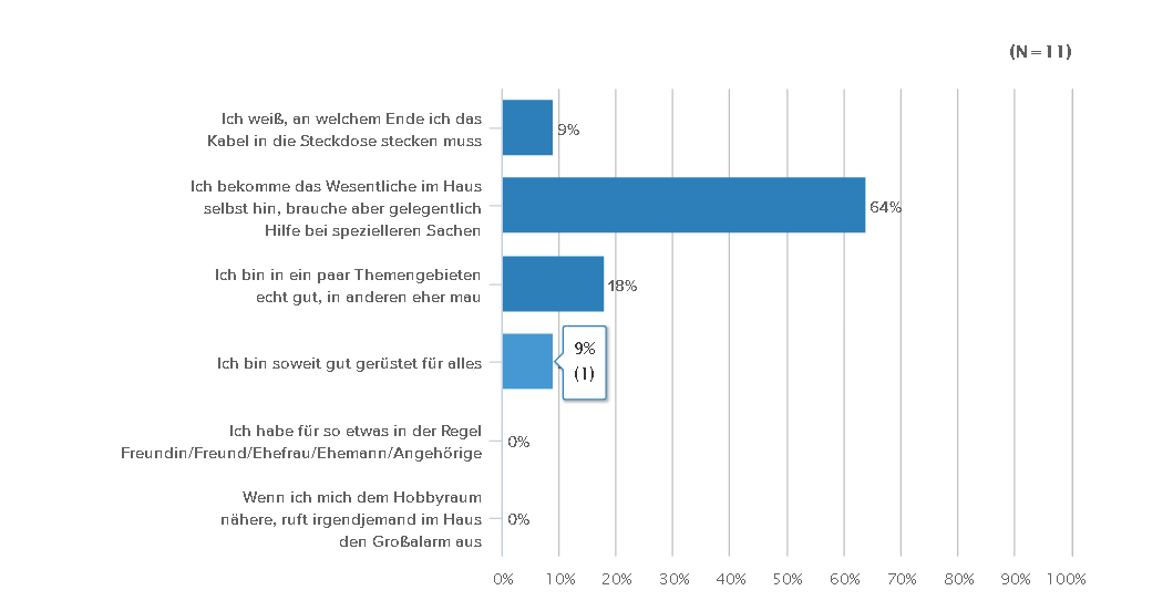
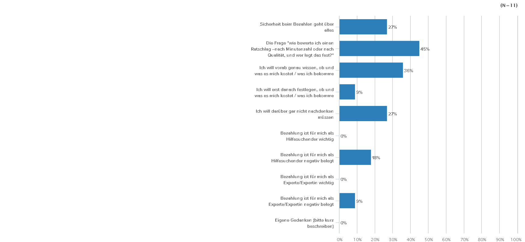
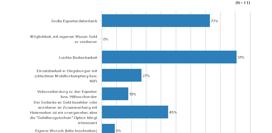
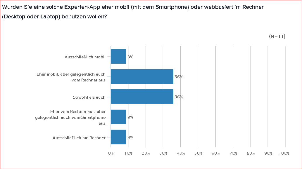
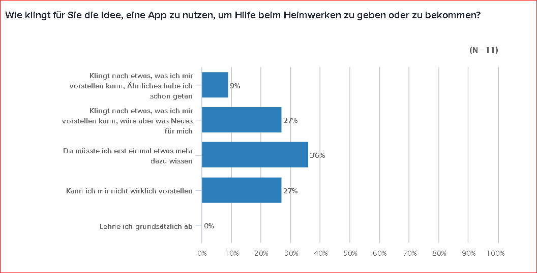
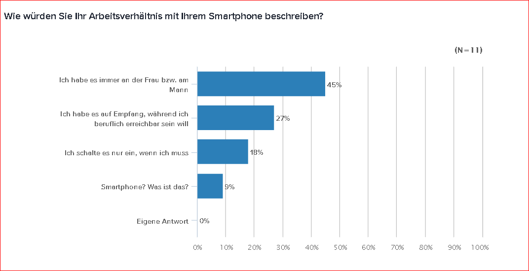
My UX survey questions touched on subjects like
- Preferred kinds of DIY work / areas of own expertise, if any
- Preferred methods of acquiring help
- Ease or unease about paying or accepting payment for DIY advice
- Definition of a „fair compensation“ for DIY advice
- Mobile app payment proficiency and preference, data privacy and bandwith use concerns
And what did users think of the name HAMMERHEAD?

Oh well.
Better to have a controversial name than one that is easily forgotten. I decided to stick to it for now and commission a
MASCOT
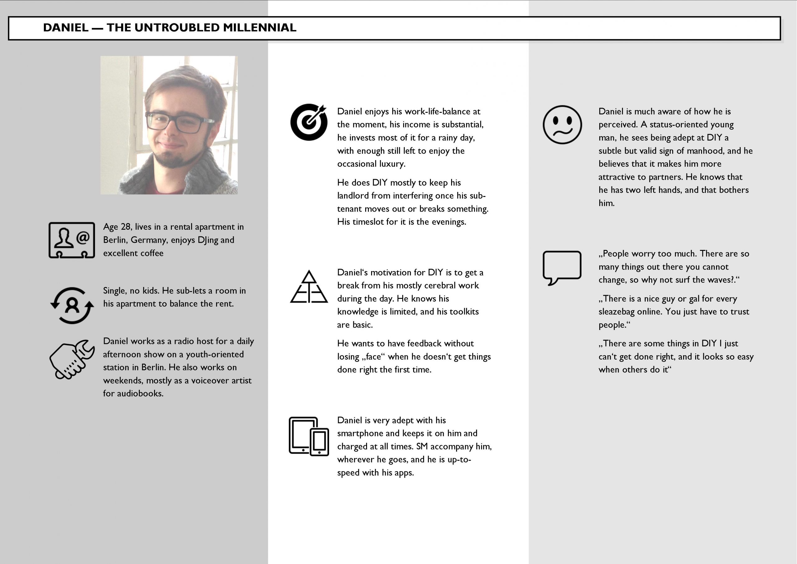
USER PERSONAE
The next step had me think about people to keep in mind before I would set out to create architecture and flow, leading to a sequence of screen design iterations.
So who would I see here that would ask themselves if they should avail themselves to this expert app?
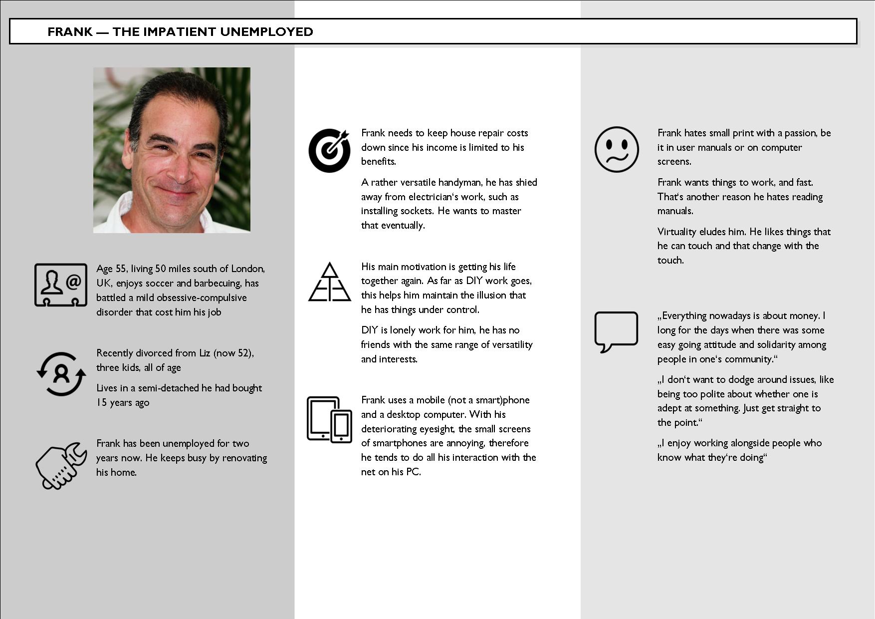
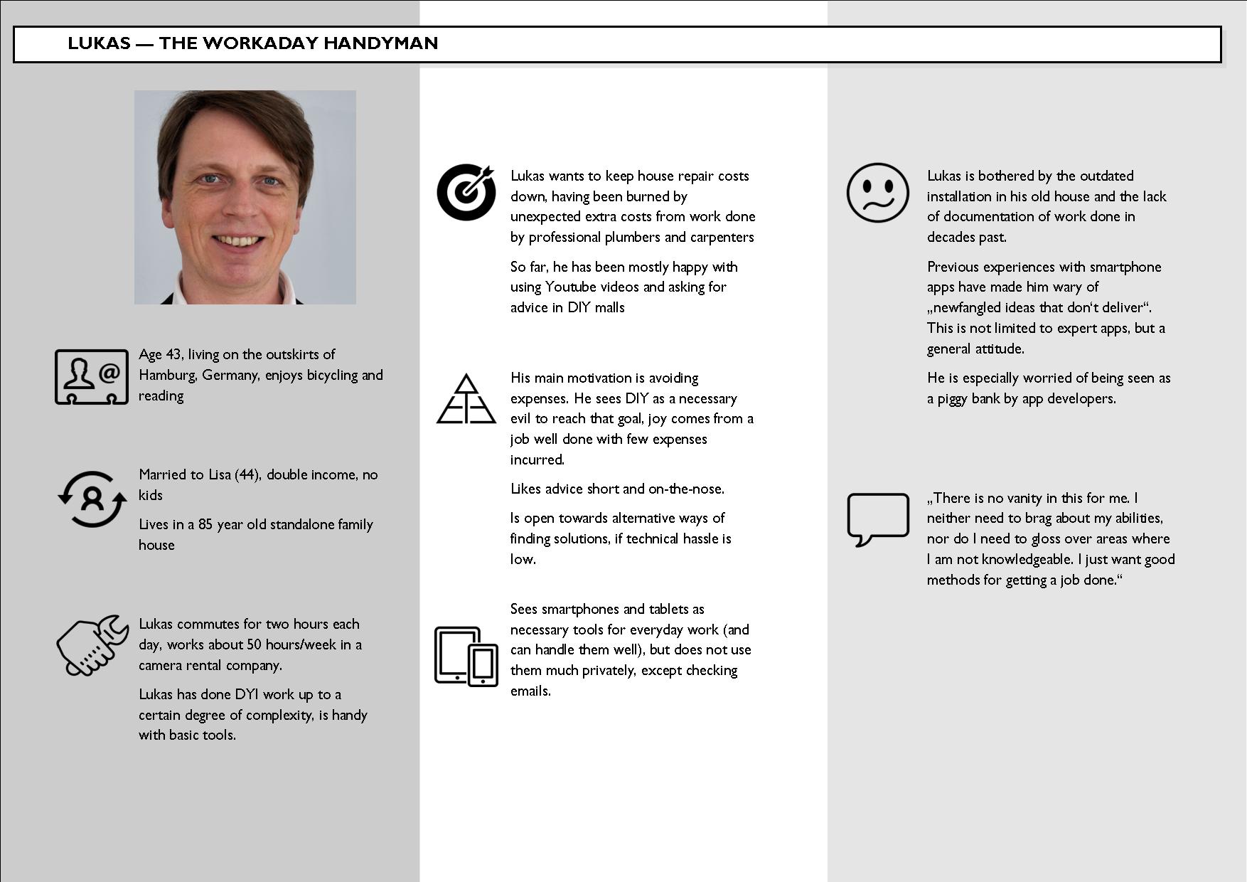
While the cliché appears to be true that the majority of DIY enthusiasts are male, their backgrounds would be different. So using photos from friends, I re-envisioned them as members of a particular subset of users with different, sometimes opposing viewpoints and approaches:
These imaginations helped me on the way to start creating information architecture which would set me on the path towards the
ITERATIONS OF WIREFRAMES
Onboarding
Saying hello to one’s audience is the only chance to make a good first impression. Steps in the evolution of the first screen involved the positioning and look of the „Hammerhead mascot“ and experiments with fonts and color schemes.
Main menu (user wing)
Very early on I wanted to help users who had just come off working with tools (and thereby had just engaged their gross motor skills) not miss the main buttons. That is why I chose big square buttons, eventually scaling them differently to allow for a „size = importance“ look. The change in color scheme from blues to browns relegated the mascot to the background.
Expert database (categories)
Once a user starts looking, having them first choose the DIY category seemed like a logical choice. When the initial design began to look a bit boring to me, I experimented with backgrounds until I adopted the square buttons idea for these screens, too, and made the leap to hint at „more to see“ below the fold in the final iteration.
Expert database (listing)
It was actually peer review that alerted me to a major oversight: the early screens had shown a simple all letters listing of names and (self-styled) professional assessments of experts. That was a no-no, not just because it would violate guidelines in both iOS and Material Design, but it would also look boring and not engaging enough.
The solution presented itself quicky: take the square buttons for consistency and fill them with nice portrait pictures of the experts-in-waiting.
Expert profile screen
The challenge for me here was screen real estate. How would a user see and react to what kind of info about an expert, and how could all of that possibly look good? In the final iteration the square buttons and the idea that not all would need to be seen at first glance came to the rescue. By having the footer menu cut the appearance of the lower buttons in half, the user would logically assume that there was more to be seen and scroll down …
Want to see for yourself?